Expertise
Brand / Strategy / Campaign / Design / Content
Channels
Print / OOH
how to unite
a diverse community
WITH OLD-FASHIONED CHARM
Bang’s mission was to give Glebe an identity that attracts visitors and makes the precinct a must-see destination on tourist itineraries. Even more importantly the brand had to unify and celebrate the many faces of this bohemian suburb.
The Challenge
With this project we had to balance the needs of local government, businesses, residents and visitors. How could a single strong identity encompass all these different groups and resonate using online and outdoor media?
THE solution
We hit the streets of Glebe, talked to people, explored laneways, drank coffee. We noticed there’s always something happening, whether it’s the
markets, a hip new venue or the bohemian street life. The community might be socially and economically diverse, but the place was united by a
dramatic resonance – it’s like one big performance space.
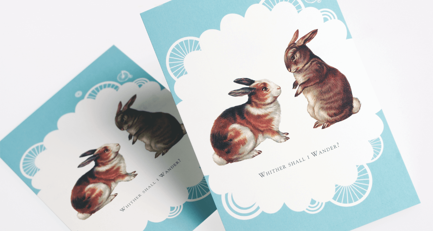
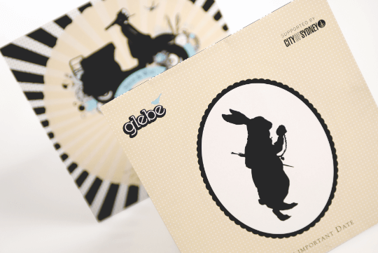
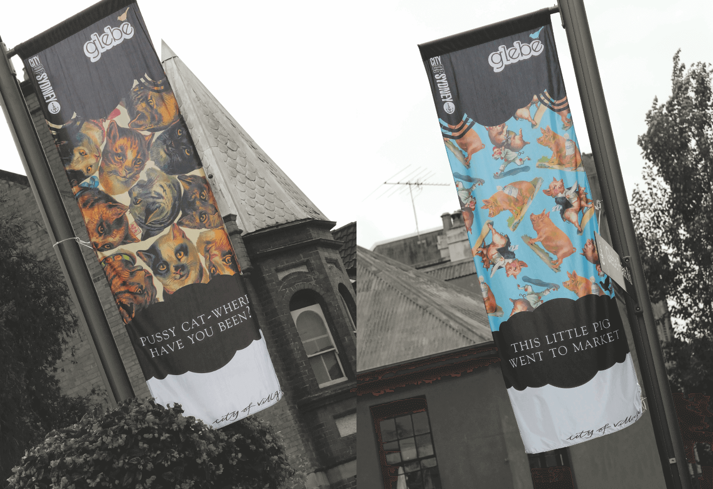
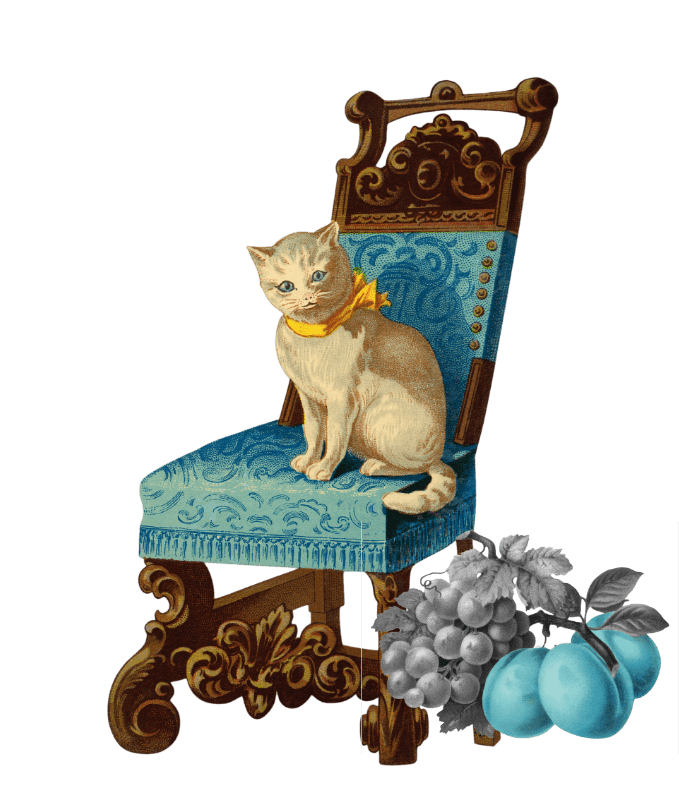
To capture this unique personality, we used a theatrical design style featuring characters from classic English nursery rhymes and folklore to
evoke the quirky personality of the much-loved suburb.
THE Process
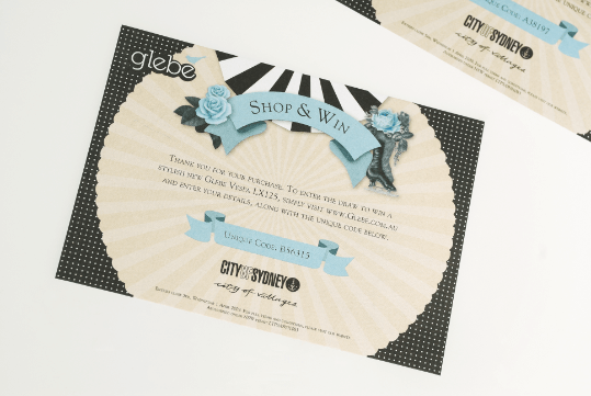
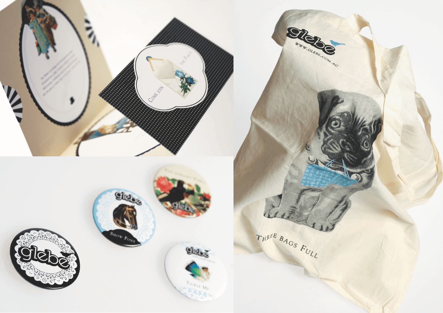
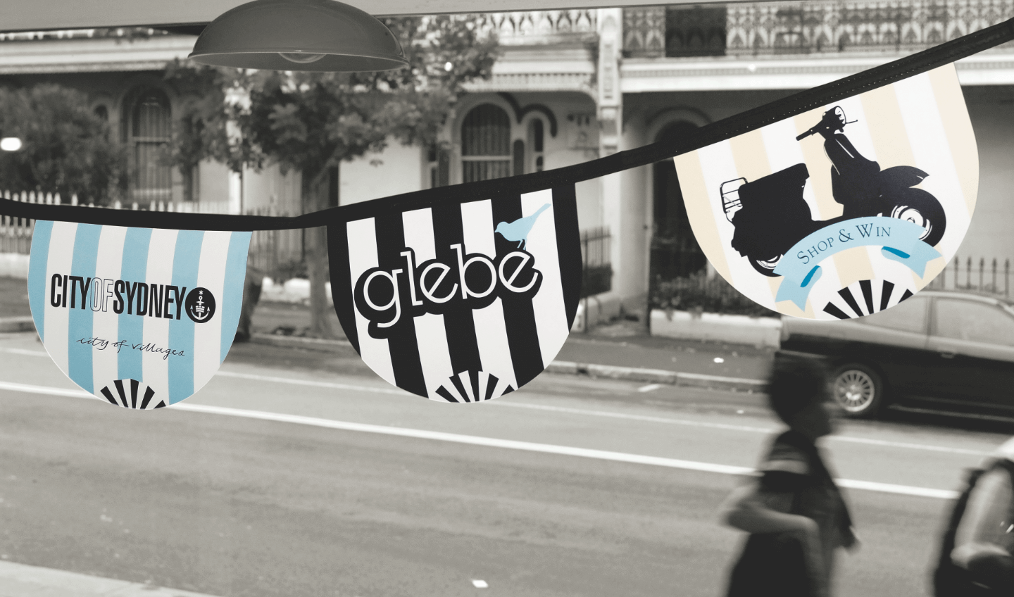
Bang used Victorian imagery and quaint design to develop logos, the brand identity and collateral. We were briefed to work within guidelines already developed through the City of Sydney’s ‘City of Villages’ brand strategy.
It was crucial for the brand to have multiple touch points throughout the suburb and online. We designed street banners, a website, posters, advertising, postcards, badges, retail promotions and shopping bags. We also worked with the ‘150 Locals’ project to turn Glebe into an outdoor gallery, featuring portraits of Glebe residents in local parks, cafés, restaurants, and out and about on the streets.
Paul Angell, President, Glebe Chamber of CommenceWe were blown away with the interpretation of the brief. The use of
Victorian illustrations in the design was both humorous and engaging – it
not only looks different from all other suburbs in the area, it’s also distinct
from all other brands. We feel like we own a new space.
Expertise
Brand / Design
Channels
Print / OOH